For my design assignment, I came across a brilliant retro poster task on the assignment bank. I wanted to do something that that would mean something to me in the long run. This particular task caught my eye, as I enjoy the colour schemes and pixelated effect used in many of these types of posters. The dated fonts and the use of shape and colour remind give the pieces and ‘Art Deco’ feel. A feel that I personally can really appreciate. A lot of my inspiration came from this page on Pinterest.
Many of the posters used within this interesting effect are advertising a big city under the lights, Paris or New York for example. However, my thoughts brought me to an idea that contrasts this. I decided to glamourise and sell my small, picturesque village, Great Bardfield. I thought it would be an effective use of the style, however used for a different purpose to many. Essentially, the story behind the story mainly comes down to me wanting to create and share something that meant a lot to me personally. After seeing a consistent style with other art deco posters Such as the images below, I wanted to use a similar style as inspiration, but adapt it to fit my situation.
Here is the finished product alongside the original image:
I feel that in terms of style, the poster I have created really does follow along the same lines. looking at the use of font for example, I have used both the sans serif, large, bold fonts, as well as using the cursive, more stylish, informal font. I’ve also changed the images pixelation to make it more of a sketchy, cartoon sort of image. The image I used was one I took of my dog out on a walk in her favourite place, back in the summer last year. It is one of my favourite images, therefore it only felt fitting to use it.
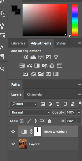
To do that, I had to use the load the image into Photoshop and head over to the ‘filter’ tab, followed by t he ‘filter gallery’ setting. It then comes up with an option menu like this. All of these different settings give fantastic effects. however, the effect I had intended to get was most like the one achieved when using the ‘Cutout’ effect. The preferences on the right hand side were the ones I used for this particular image. This gave the more pixelated effect, a more cartoon look to the image.

The next settings to change were the ‘Curves’ This changed the colour of the image. I only edited it ever so slightly, as I didn’t feel a huge amount was necessary. The reason I decided to do this, was to take a little of the vibrancy out, as the other posters similar to it weren’t so vibrant.
The final thing I did was the text. The colour scheme was selected using the eyedropper tool from the beige, wheat field in the middle. This was to give a consistent look to the image and so the text didn’t stand out too much. The cursive font was simple. I just put it in white, transformed it and rotated it slightly and put a drop shadow on it. All of these pieces of text complement one another to give the desired effect.
Overall, I decided to do this assignment, as I felt that it would be clever to use a very well-known style of poster, yet develop it and adapt it in my own way, to create something that I was proud of and could look back in the future. Using Art Deco as an inspiration, I feel that the use of this image was effective and worked well with the selected style.
Visit Great Bardifeld – Design Assignment – Best work
Image on Social media –
Flickr
Twitter


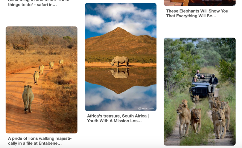 Images like these really get me excited to try and make a holiday of such magnitude happen for real, as it would really be a dream come true… I guess thats why this assignment was called a dream holiday!